Knovolo Mobile Marketing Reviews
Smithsonian Channel Mobile Marketing for Aerial America
Comments Off on Smithsonian Channel Mobile Marketing for Aerial America
I came across a fantastic mobile engagement on the back of this year’s Smithsonian Folklife Festival brochure. These guys really put a lot of thought into this mobile promotion, and for the most part, it created an excellent mobile user experience in a time when many marketers are throwing together poor mobile campaigns.
More Ways Than One
Many mobile campaigns these days only offer one door for mobile users to walk through: a QR code, a SMS call-to-action, or maybe a link. A solid mobile campaign will offer several different doors to accommodate the myriad of devices and user preferences out there, and this Smithsonian Channel ad does just that. They offer a QR code, a SMS call-to-action (text AERIAL to 74699), and they spell out the link that the QR code and SMS point to: http:smithchan.com/aerial.
This approach is critical for including the highest possible number of mobile users. Although QR codes have been out for a while, the majority of people in America don’t know exactly what QR codes are for, so relying on that as the only way for consumers to interact with you on their mobile devices is like trying to sell a book written in Greek to New Yorkers on their lunch break.
SMS (text messaging) is a widely supported technology among mobile phones (essentially supported by all mobile devices), but some users are cautious of getting extra charges, using up their allotted texts, or getting spammed in the future and may not want to text in. Also, SMS great for having users sign up to receive periodic text updates or coupons from you, but again, if you rely on it as the sole means of interaction with mobile users, you will be leaving some people out.
This is why it’s important to offer the URL itself, in print, in addition to other mobile entry methods discussed above. People who aren’t comfortable with other methods can always access your mobile content the “hard way” by typing in the web address themselves, and Smithsonian Channel even makes this easier with a shortened URL (although this could be a lot shorter). However, for mobile users who are accustomed to scanning QR codes and texting to short codes, entering a URL is almost as bad as having to write down the website on a napkin so that they can visit later when they’re in front of a computer.
In addition to all of these mobile calls-to-action, there’s a traditional website link (www.smithsonianchannel.com) printed near the bottom of the ad. The mobile engagements are important for catching people right when they see the ad, before they forget and move on with their lives. If, however, for those that take the ad all the way back to their computer (like I did), it’s quite insightful to have a small line telling us how to get there without using a cell phone. This makes it easy to watch the videos comfortably on our larger computer screens.
Mobile Web
The mobile website that the QR code, text messaging, and URL take you to (http:smithchan.com/aerial) is quite well done and looks great on all the smartphones we tested it on. The page is very nicely formatted, and the 45-minute episodes streamed quite well, with few breaks or interruptions. We saw some HTML5 in the source code, and like how the page fills all of the mobile screen, no matter its size. (It doesn’t look very good on computers, but it’s not supposed to!)
The only disappointment we encountered was viewing the website on non-smartphones. There was no simpler code served to basic feature phones and the like, which means that those types of devices try valiantly to load the whole page, but ultimately fail in rendering anything usable. This page uses some JavaScript and advanced CSS that feature phones, older smartphones, and most Blackberries should not be expected to render at all, so there should a much lighter version of the mobile web page for these older/more basic devices. They ought to be able to read about Aerial America and learn about where they can watch the free episodes. There could, for example, be a form where the users enters their email address to receive links to the episodes so that they can watch later from their computers.
Here at Knovolo, we have been developing our own “advanced device detection” technology to address this problem. In fact, as of last month only 35% of American adults own smartphones. Mobile marketing campaigns that don’t address non-smartphone mobile users are leaving out a lot of people.
Summary
Aside from isolating non-smartphone users, this mobile marketing campaign for Smithsonian Channel’s new Aerial America was excellent. We hope that others marketers that are venturing into mobile will have mobile websites and call-to-actions of similar quality.
Tags: Mobile Marketing, mobile phone, mobile video, mobile website, QR Codes, Short Code, SMS, Text Messaging
Texting for “Free French Fare” at Mon Ami Gabi
Comments Off on Texting for “Free French Fare” at Mon Ami Gabi
The marketing folks at Mon Ami Gabi were certainly headed in the right direction when they set up their texting program, but it falls short in many ways.
As a customer that is rather attached to my mobile phone, I was intrigued by the text message call-to-action (CTA) on this flyer. I texted in the slightly-awkward keyword to the short code, expecting to find out what “French Fare” meant. All that I got back was an automatic response message thanking me for signing up, telling me that I can opt out, and assuring me that I wouldn’t receive more than 4 SMS a month.
This was quite anticlimactic! I’m now signed up for something, but I don’t know what it is. Coupons to the restaurant? A T-shirt? A free trip to Paris? There’s nothing further for me to interact with and I have nothing in particular to look forward to.
I would prefer that the flyer or response text message explain what is going on. It would be nice to have a clearer incentive follow the CTA, and immediate gratification for having texted in. I’d like to know that I’m now part of the MAG “mobile club,” or that next time I can reserve a table via text, or that I can get a free drink at happy hour next week by presenting my confirmation SMS to the server.
Overall, Mon Ami Gabi is certainly headed in the right direction to engage its customers on their mobile devices, but this campaign reminds me of what we were doing in 2007. Today’s mobile campaigns should have one or more of the following: excellent mobile-optimized webpage, QR code/MS Tag, social network integration, clear CTAs, mobile coupons, mCommerce options, GPS functionality, and something that immediately grabs consumers.
Nevertheless, this is further proof of mobile marketing and engagement finally having a real presence in retail & marketing in the United States, and I look forward to MAG’s next mobile effort!
Tags: Mobile Marketing, mobile phone, SMS, Text Messaging
Taco Bell Thinks ‘Outside the Bun’ with its Mobile Experience
Comments Off on Taco Bell Thinks ‘Outside the Bun’ with its Mobile Experience
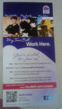
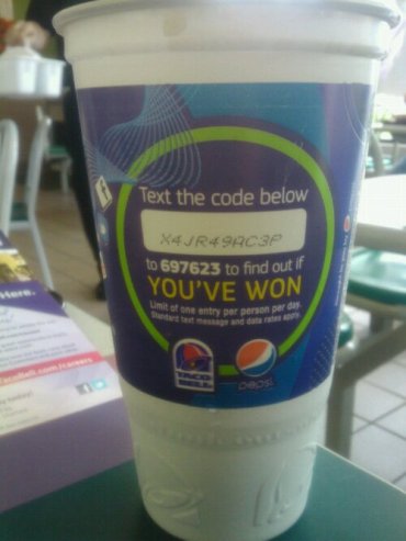
While enjoying a couple of supreme tacos today at Taco Bell, I was delighted to find two supreme mobile call-to-actions:
1 | The first was a flyer advertising jobs at Taco Bell. It had a QR code which, once I scanned it, took me to a page about jobs and careers at TBell. This page looked pretty good on my MyTouch, and featured a video which played nicely.
The job search feature worked quite well, and it was very good that they added a link to the full site in case you somehow ind yourself in the mobile version on your computer.
They also provided a web address to enter – this is crucial because many mobile users aren’t familiar with QR codes yet. It was confusing, however, that the web address they spelled out, www.tacobell.com/careers, isn’t the same one that the QR code points to. In fact, once you land on www.tacobell.com/careers with your mobile, you get directed to m.tacobell.com, their mobile homepage, and since there’s no link about careers, it’s a dead-end. This means that non-QR code users can NOT actually get to the career content, which isn’t happy.
2 | Next, I spotted an SMS (text message) call-to-action on my cup. This user experience wasn’t quite as seamless as the last recruitment flyer, but was functional nevertheless. The code was long and tedious to enter on a mobile phone and the text message responses were very technically worded and lacked the pzazz of the wording on the cup, but overall it functioned just fine. Perhaps I’d have been happier if I’d actually won something.
Room for Improvement
The mobile landing page was a little too wide for my screen and created the need to scroll sideways just to see the whole thing.
There was no other way than scanning the short code to get to career link on a mobile.
To do a job search, I had to enter my city or zip code. Why not also have the option of using my GPS to determine my location? It’s a fair bet that if I’m looking at the flyer, I’m probably standing in the part of the world where I’m interested in working.
Takeaway
Overall, I was quite impressed with Taco Bell’s mobile efforts: they appear to be at the forefront of eateries as far as mobile marketing & mobile engagement is concerned. There are certainly a few things they could improve upon, but the webpages were mobile-optimized, and everything worked, which is more than you get with many of today’s mobile efforts.
I’m looking forward to seeing how Taco Bell will continue to think outside the bun.
Tags: Mobile Marketing, mobile recruiting, mobile video, QR code, SMS, taco bell, Text Messaging


